Tweaking Python Dash Apps’UI
This post is about synergy, UI’s and Python. All in one.
Let’s explore the impact of UI color and layout. We’ll embark on this exploration through the lens of the Python DASH App Trip Planner with weather patterns that I have developed during this year to help anyone have better chances with weather on their adventures.
Discover how the carefully chosen colors breathe life into every interaction, evoking emotions and setting the tone for your adventures. And of course, let’s do that with Python.
DASH APP UI - Why should I care?
The Layout
The UI layout is of utmost importance as it determines the arrangement and organization of elements within a user interface. An effective layout contributes to a seamless and intuitive user experience by optimizing visual hierarchy, logical flow, and ease of navigation.
A well-designed layout ensures that important information and interactive elements are prominently displayed, reducing cognitive load and enabling users to quickly grasp the purpose and functionality of the interface.
Choosing Colors
Colors play a crucial role in user interface (UI) design as they have the power to evoke emotions, communicate information, enhance usability, and create a visually appealing experience.
Color choices can influence user engagement and perception, helping to establish a brand identity and improve overall user experience.
Different colors have distinct psychological associations, such as blue conveying calmness and trust, red evoking urgency or excitement, and green representing nature or growth. Proper color combinations and contrasts aid in readability and accessibility, ensuring that users can easily distinguish elements and navigate through the interface.
Choosing your UI colors might seem a trivial part of our work, but it can make the difference for more users than we think. And in the end of the day, we want our solution to be useful for as many people as possible.
Customizing the Chart’s UI
Line charts and box plots are both commonly used for visualizing data, but they serve different purposes and are suited for different types of data analysis. Here are the main reasons why you would choose one over the other:
About Line Charts:
-
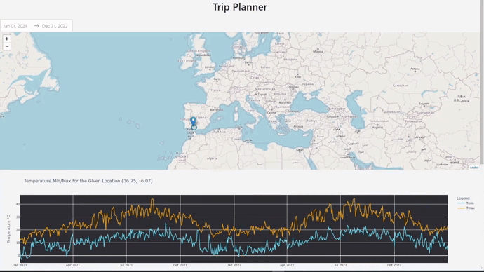
Trend Analysis: Line charts are ideal for displaying trends and patterns over time or across a continuous variable. They are particularly useful when you want to show the relationship between two variables, such as tracking stock prices over a period or visualizing changes in temperature throughout the year.
- We can observe and decide the best season for our next trip based on this.
-
Continuous Data: Line charts are suitable for displaying data that is continuous, such as measurements taken at regular intervals or over a continuous range. The line connects the data points, providing a smooth representation of the data flow.
- We are displaying daily data, for example of the Temperature max of the selected location.
    fig = px.line(df_meteostat, x='time', y=['Tmin', 'Tmax'],
                  title=f'Temperature Min/Max for the Given Location ({lat:.2f}, {lon:.2f})',
                  labels={'time': 'Date'},
                  color_discrete_sequence=['#66E5FF', 'orange']) #here I am using one color for each trend line
    fig.update_yaxes(title_text='Temperature °C')

    fig.data[0].name = 'Tmin'
    fig.data[1].name = 'Tmax'

    # Update the legend title
    fig.update_layout(legend_title='Legend',
                      plot_bgcolor='#2E2E33', #and these 2 are modifying the default plotly's colors.
                      paper_bgcolor='#F5F5F5')
About BoxPlots
-
Distribution Comparison: Box plots are effective in comparing distributions between multiple categories or groups. They provide a concise summary of the data’s central tendency, spread, and skewness. You can easily identify outliers, quartiles, and the overall shape of the data.
- We can see how different parameters (rain, wind, temperatures…) behave on the selected location and time range.
-
Categorical Data: Box plots are suitable for displaying data that is categorical or discrete, such as comparing the performance of different groups, treatments, or categories. Each box represents a group, and you can compare their statistical properties.
- In this case, we are comparing months of the year.
Customizing a BoxPlot in Python
    fig = px.box(df_meteo_boxplot, x='month', y=variable, title='Monthly Summaries -  Boxplot')

    fig.update_xaxes(title_text='Month')
    fig.update_yaxes(title_text=('Max Temperature (°C)' if variable == 'tmax' else
                              'Min Temperature (°C)' if variable == 'tmin' else
                              'Wind (km/h)' if variable == 'wspd' else
                              'Rain (mm)'))

    fig.update_traces(marker_color='#21B1CF', line_color='#21B1CF') #This will be the color of the boxes and the outliers


    fig.update_layout(plot_bgcolor='#2E2E33', #and these two, the colors of the boxplot itself
                      paper_bgcolor='#F5F5F5')

    return fig
FAQ
How can I try the Python DASH App?
Trying the app locally might be an easy process for people that are familiar with software development. But I want this project to help as much people as possible.
- For that reason I deployed the DASH App at home using Docker and Cloudflare Tunnels.
- You can use it for free from any browser at: https://trip-planner.fossengineer.com/
How can I Contribute?
- I have made all the code Open Source and this is the public Github repository where I have built the code, please feel free to have a look, experiment with the code and suggest any improvements:
- The Python Trip Planner with Weather Github Repository.
- Don’t have a IDE right now? Have a look to the .ipynb notebook that I used to integrate the packages with Google Colaboratory:
